| PM | Quote | Reply | Full Topic |

| Joined: | Thu Jan 31st, 2008 |
| Location: | Huntington Beach, California USA |
| Posts: | 623 |
| Status: |
Offline
|
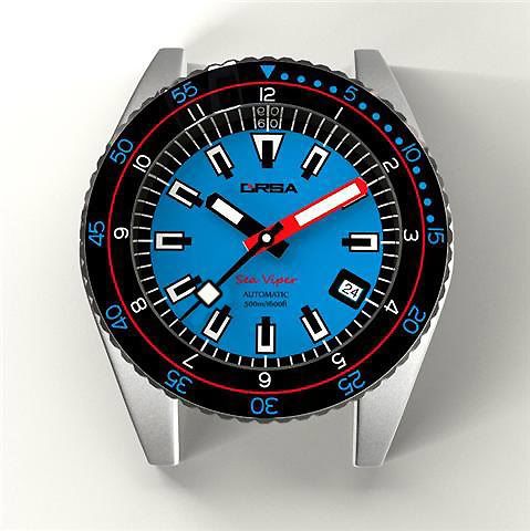
The sample I created below addresses the above comments: I reduced the second hand lume square by a touch over 15%, and filled in the date window with black to keep in concert, and proportion with the rest of the bold elements. Kudos Berg... awesome watch you got here!
Last edited on Wed Jun 24th, 2009 02:08 am by JDBuckwell