|
|
| Welcome to 3T! Please take the time to register and join in on the friendly,knowledgeable watch talk.Please note that not all registrations will receive an immediate activation e-mail.Those who do not receive an immediate notification will be activated manually within 48hrs. by an admin. without an e-mail activation url sent to you,you may then sign in using your username and password,if you feel there is a problem please e-mail us at timetechtalk@hotmail.com and include your name and username and we activate your account.Thank You! |
| Moderated by: 3T | Page:  |
|
||||||||
| Triton 2000m "Midnight Zone" | Rate Topic |
| Author | Post |
|---|
| Posted: Mon Nov 2nd, 2009 09:47 pm |
|
13th Post |
|
stew77 Admin 
|
I am liking the design of this new Triton 2000m quite well. The thing that I think has thrown me off a bit (and I may still be trying to put my finger on it), on these new Debaufre dial designs is the Debaufre "Sun" on the dials above the Debaufre name and some of the additional dial circles (with contrasting textures). I think that I may be interpreting these dial designs as visually "less classic" and more "fashion watch" in design, but at the same time I think it may have something to do with the graphics I am looking at. I would love to see some true to life shots under outdoor lighting as I know that these Debaufre designs always have more of an impact in real life (I know that I appreciated my Csar even more in person!!!hand6.gif). The different hand set that Debaufre is using on these new ones is starting to grow on me.hand6.gif I will keep looking at these though...I do know that I really like the Debaufre brand...they are a tremendous value for the dollar and a quality piece at any price...just very, very well made watches!!
|
|||||||||
| ||||||||||
| Posted: Tue Nov 3rd, 2009 01:03 am |
|
14th Post |
|
bigrustypig 3T WIS 
|
stew77 wrote: I am liking the design of this new Triton 2000m quite well.Bullseye, Chris! There's something about that "sun" that doesn't seem to fit the overall look of the watch and the profile of its character. But then again, they might be trying something new...
|
|||||||||
| ||||||||||
| Posted: Tue Nov 3rd, 2009 11:03 am |
|
15th Post |
|
stew77 Admin
|
bigrustypig wrote: stew77 wrote:I am liking the design of this new Triton 2000m quite well.Bullseye, Chris! There's something about that "sun" that doesn't seem to fit the overall look of the watch and the profile of its character. But then again, they might be trying something new... Thanks Jeff...sounds like I'm not the only one struggling with these new designs. They are definitely trying something new...it's just taking me a while to warm up to these new ones.
|
|||||||||
| ||||||||||
| Posted: Tue Nov 3rd, 2009 11:21 am |
|
16th Post |
|
elemental 3T WIS
|
stew77 wrote: bigrustypig wrote:stew77 wrote:I am liking the design of this new Triton 2000m quite well.Bullseye, Chris! There's something about that "sun" that doesn't seem to fit the overall look of the watch and the profile of its character. But then again, they might be trying something new... i too am having difficulties with the new designs. i was really looking foward to the new flieger, and it fell flat for me. back to dannys post, the deep blue was released and it is 599$. though, i dont like the color choices for the hands. i wish the black dialed one was an orange and white combo
|
|||||||||
| ||||||||||
| Posted: Tue Nov 3rd, 2009 12:38 pm |
|
17th Post |
|
dannyh 3T WIS 
|
elemental wrote: stew77 wrote:bigrustypig wrote:stew77 wrote: I haven't seen it posted here but on watchuseek's Debaufre forum theres a different Flieger GMT prototype that looks pretty sexy. I agree with your thoughts on Deep Blue as well, kind of an odd pairing of colors. And I agree with everyone in regards to this watch! Though I already like this watch, it appears to be a bit dressier or "fashionable". Some (most) people may disagree with me but I think Omega's Seamaster does a better job of incorporating this particular style of dial and not making it overly dressy or fashionable. I believe this watch will have ALOT of wrist presence. Last edited on Tue Nov 3rd, 2009 12:39 pm by dannyh |
|||||||||
| ||||||||||
| Posted: Mon Nov 9th, 2009 12:10 pm |
|
18th Post |
|
Janner 3T WIS 
|
I think they have spoiled the look of the dial by putting the date at 6 o'clock instead of completing the balanced look with the 3, 6, 9, and 12 and putting the date between the 4 and 5. Last edited on Mon Nov 9th, 2009 12:10 pm by Janner |
|||||||||
| ||||||||||
| Posted: Sun Feb 14th, 2010 06:19 pm |
|
19th Post |
|
alldaron 3T WIS 
|
Hello guys, Here is the first photo of the actual Triton 2000m, it's a serious diver. More photos coming soon... 
|
|||||||||
| ||||||||||
| Posted: Mon Feb 15th, 2010 12:40 pm |
|
20th Post |
|
Watchstuff 3T WIS 
|
I am sure Alldaron will be adding more info as we get closer to shipping, but here is one more...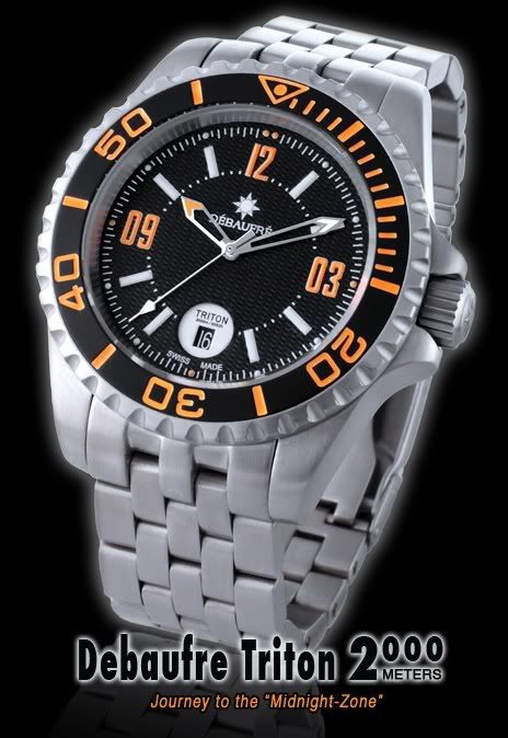
|
|||||||||
| ||||||||||
| Posted: Wed Feb 17th, 2010 12:27 pm |
|
21st Post |
|
alldaron 3T WIS
|
Hey guys, So here are some additional shots of the Triton 2000m.   More to come throughout the day... Last edited on Wed Feb 17th, 2010 12:29 pm by alldaron |
|||||||||
| ||||||||||
| Current time is 07:21 am | Page: |
| TimeTechTalk.com > Time Tech Talk > Time Talk > Triton 2000m "Midnight Zone" | Top |


